The launch strategy was our roadmap: “win over young men who think of cider as too feminine and sweet by reminding them that cider got its start as the preferred beverage of the rough-'n’-tumble types who built this country.”
This new brand had great packaging and cool TV spots, but assets for a retail launch were roughly zero, so we rolled up our sleeves and got to work building the story.
Smith & Forge | Building a Brand
Hard cider really was the preferred drink of the working man in 19th century America. And we wanted a nostalgic sense of that that history to anchor every touchpoint.
Cue anvils, hammers, steel and strength.
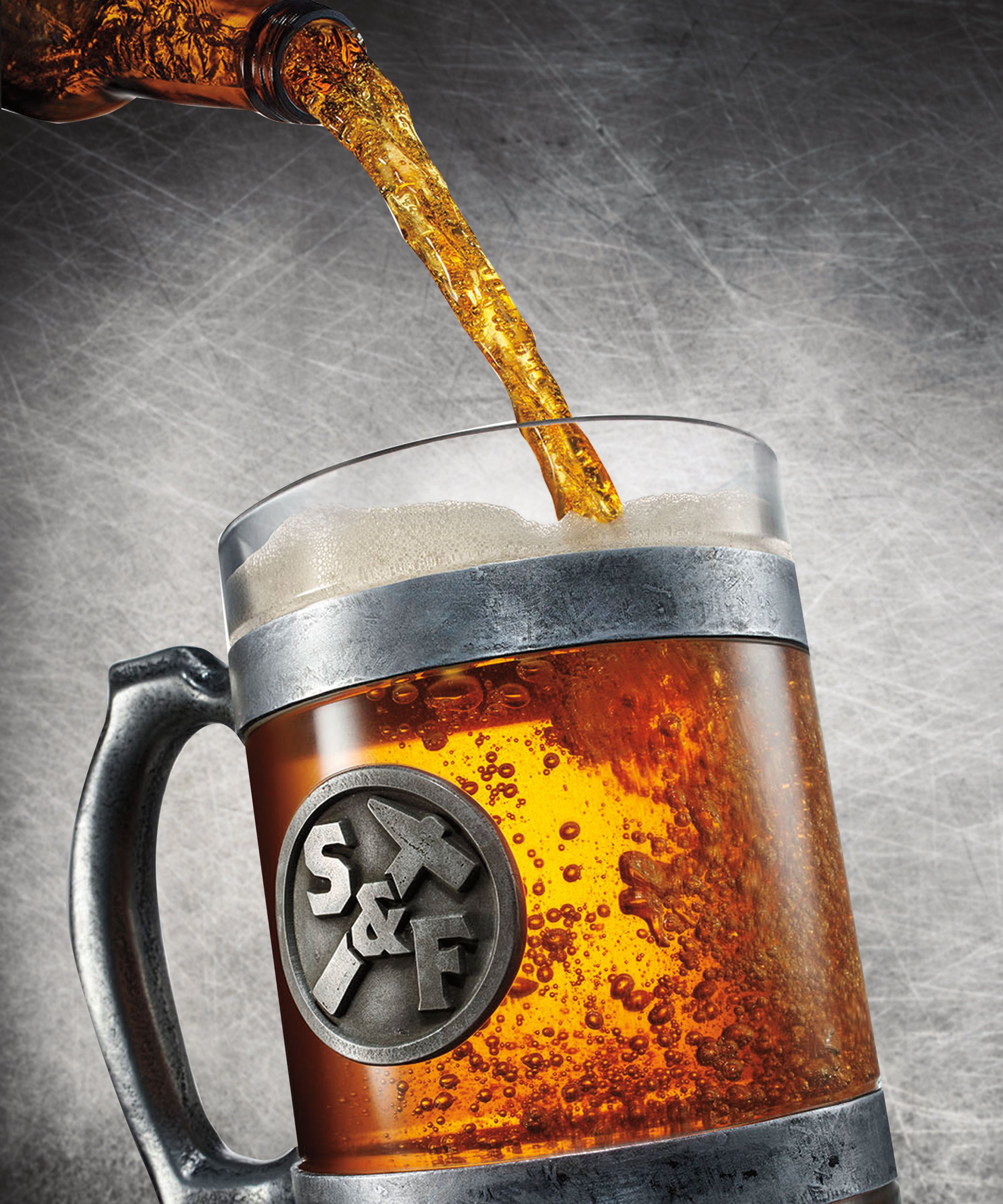
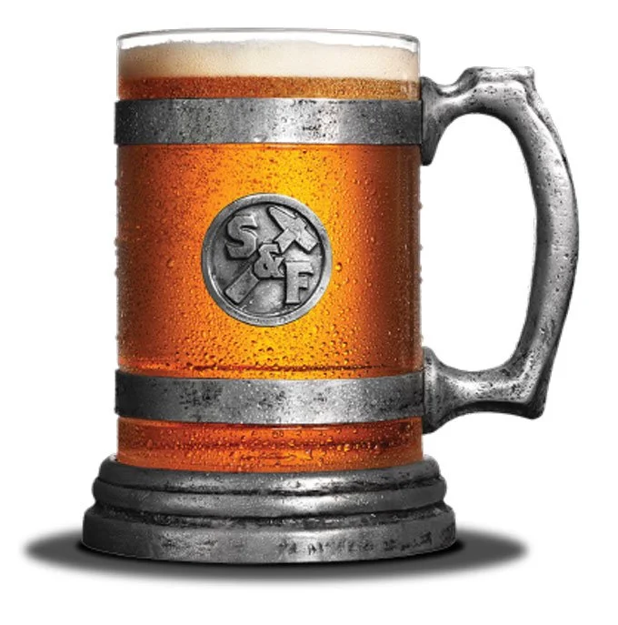
We started by building a sturdy tankard that took two hands to lift (and showed off the liquid beautifully), and continued to build out a suite of tools and visuals that brought drinkers into our story.
Forging an Icon
We created a whole tentful of nostalgic characters to sell Smith & Forge in our retail channels with a story and a wink. The engraved illustration style delivered a 19th century vibe.
Building a Cast of Characters
Retail Tools


